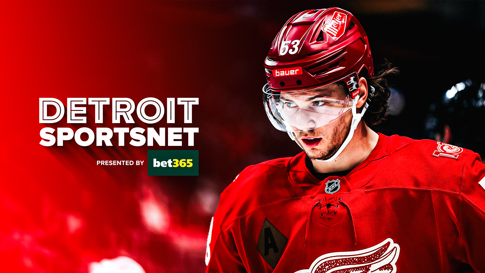
2026 Detroit SportsNet
Branding & Art Direction
01
Comprehensive visual identity, strategy, and brand voice.
02
Flexible system spanning DSN, Tigers, and Red Wings identities.
03
Unified branding across standalone and combined network applications.


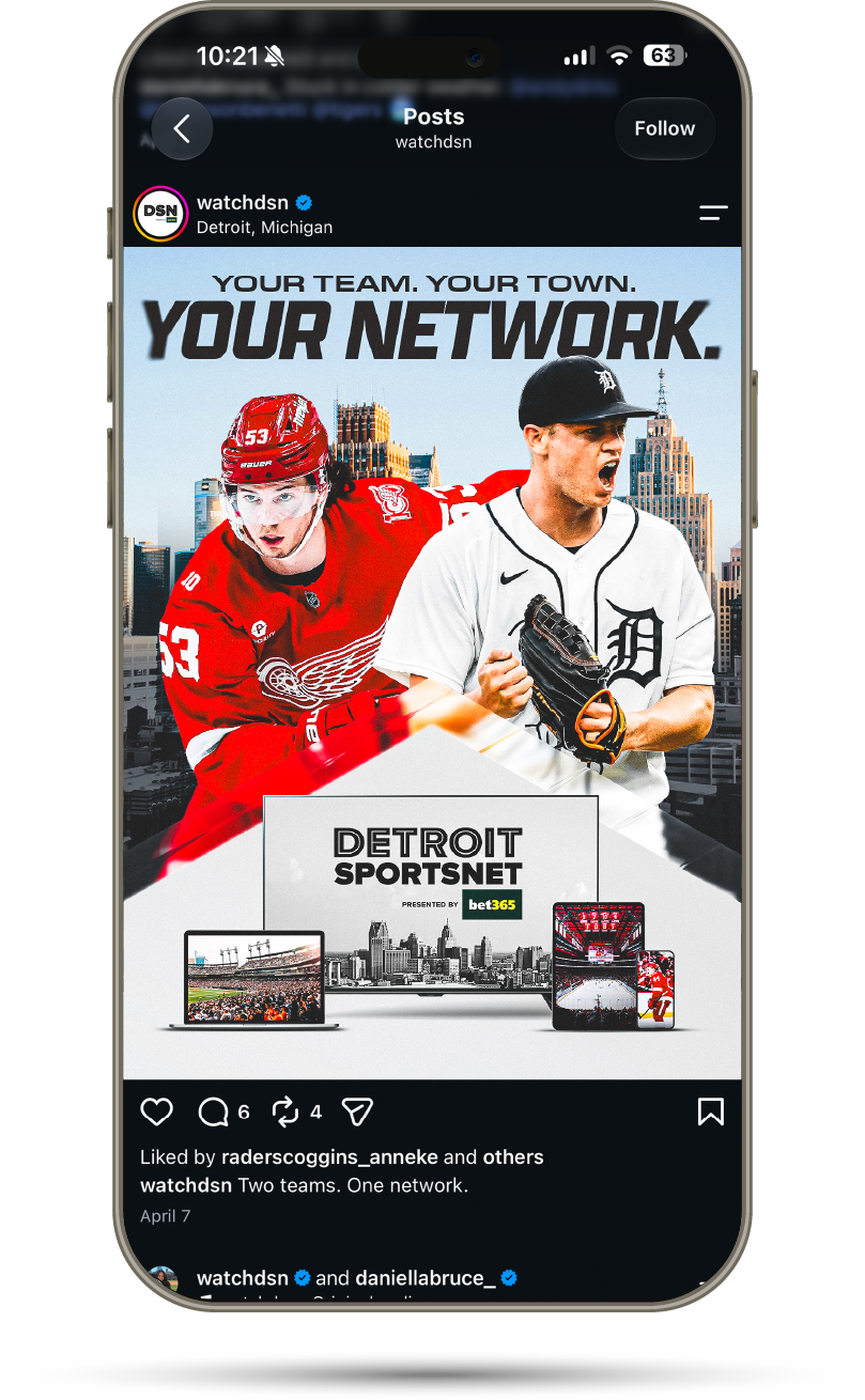
Translucent Framing
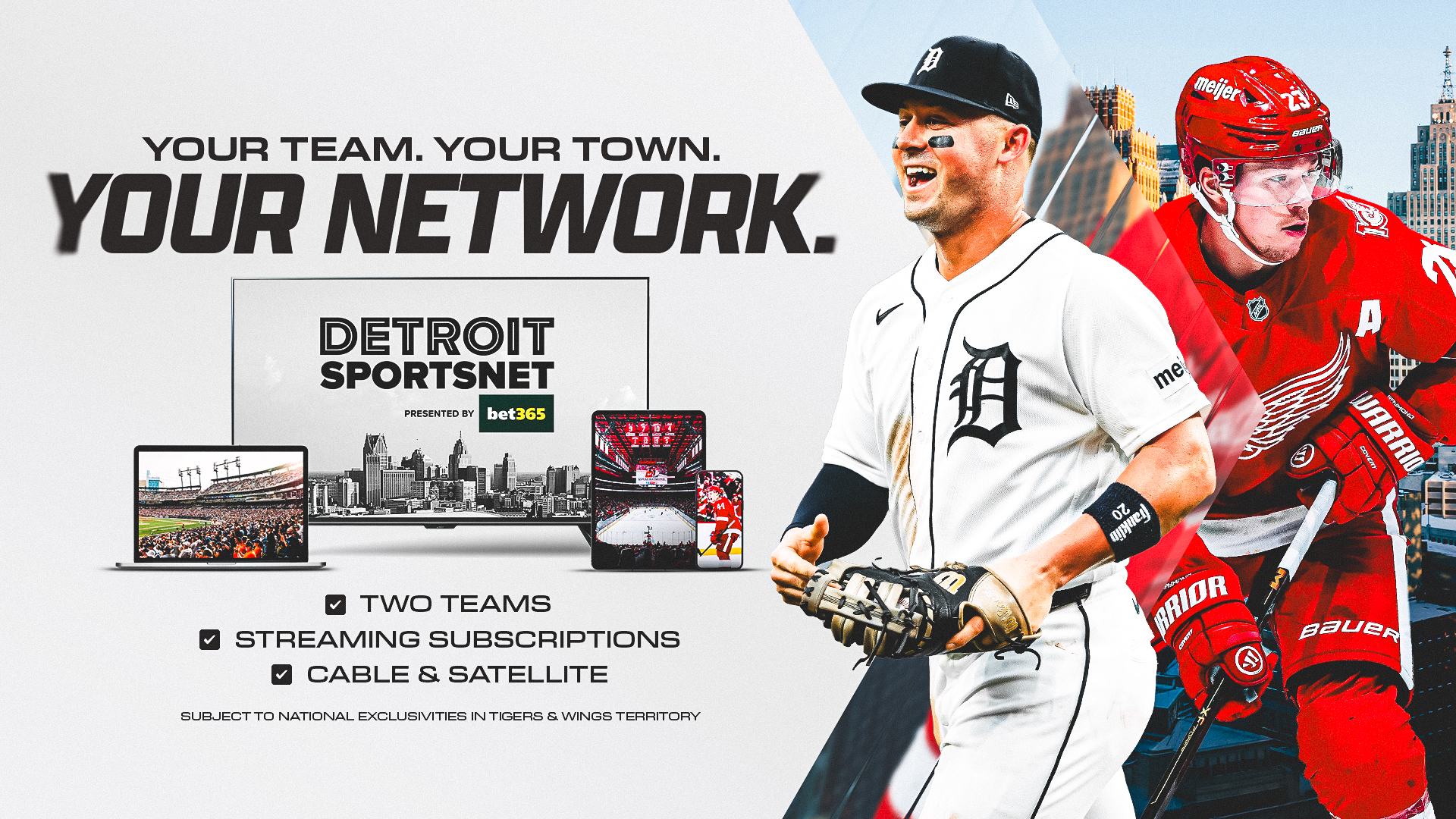
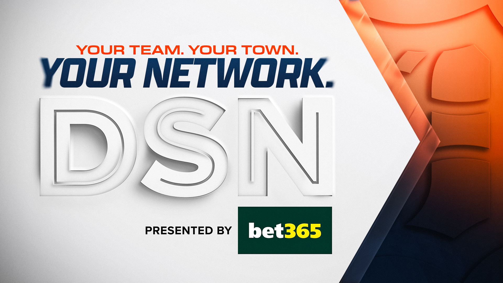
Layered, translucent framing elements are inspired by the screens and lenses through which fans experience every game, creating a visual connection between the broadcast and the city.
Designed as a clean, neutral system, these framing devices create depth, establish hierarchy, and guide the viewer’s attention while adapting seamlessly across DSN, the Red Wings, and the Tigers.
Their forms draw from Detroit’s history and urban landscape, with the hexagon referencing the Woodward Plan and the city’s original layout, and the diamond inspired by Michigan’s iconic M-route highway markers.
The hexagonal shape can be used as framing elements, containers, image crops, and graphic details to create depth, movement, and visual hierarchy throughout the system. Its flexible construction allows it to act as both a structural and decorative element while maintaining consistency across applications.

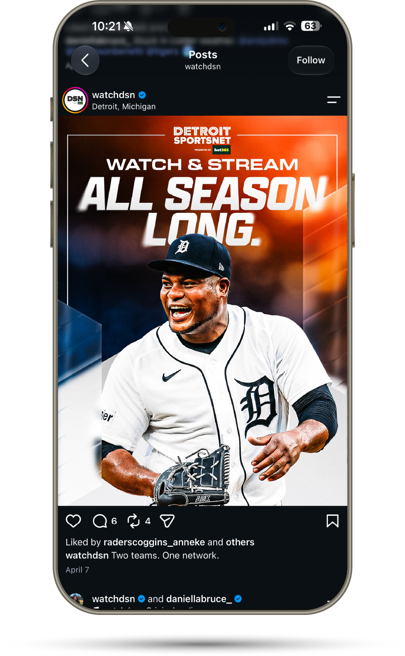
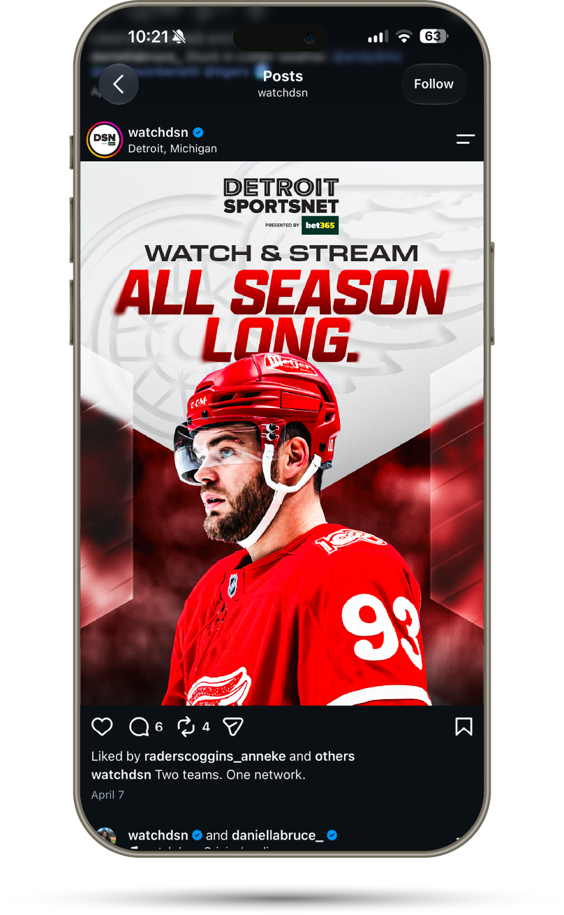
Debossed Team Logos
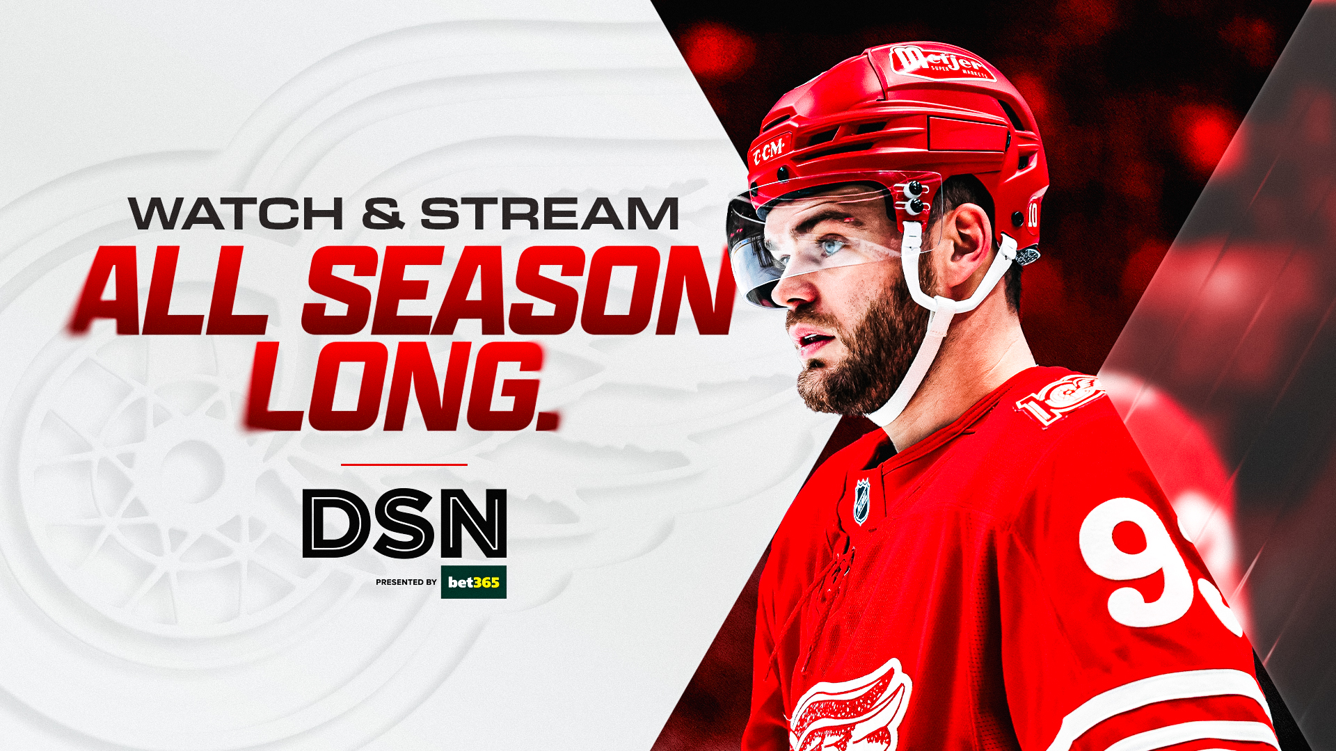
Debossed team logos can be used as subtle secondary brand elements to add texture, depth, and visual interest without competing with primary messaging or imagery.
Applied to backgrounds, framing elements, and supporting surfaces, they create a refined, tactile expression of team identity while maintaining the clean, understated aesthetic of the overall system.


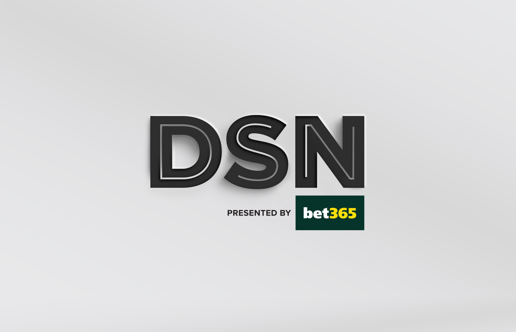
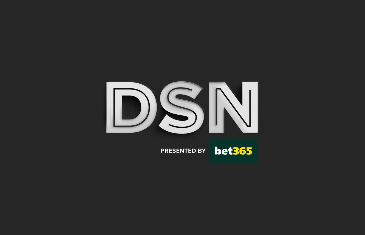
Duoboss DSN Hero
A tailored DSN duoboss hero logo is created to highlight the branding in a sleek yet premium manner, focusing on the brand itself.
This design can be utilized for backgrounds, framing components, and complementary surfaces.


Typography
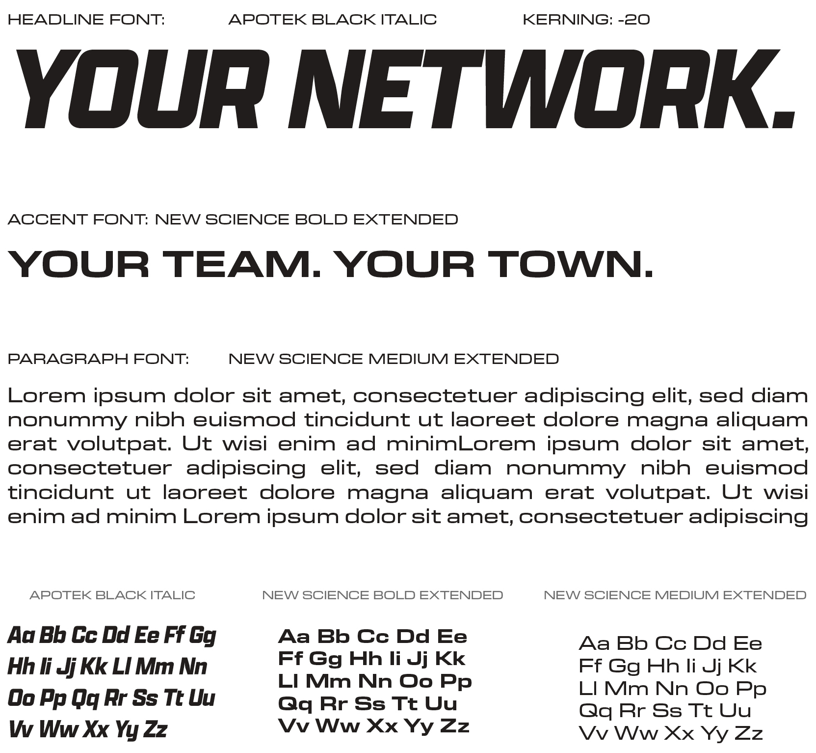
The DSN brand identity incorporates a blend of two geometric sans-serif fonts.
The combination of Apotek and New Science fonts produces a distinctive and stylized look that emphasizes the bold character of sports while maintaining a sleek and premium appearance.
Utilizing “Apotek Black Italic” delivers a commanding and impactful visual impression, conveying boldness and attitude that positions the brand as a network centered on sports.
The clean, stylized accent typeface of “New Science Bold Extendedi offers a sleek and contemporary style that balances the bold and dynamic essence of sports with the elegance and beauty of it too.
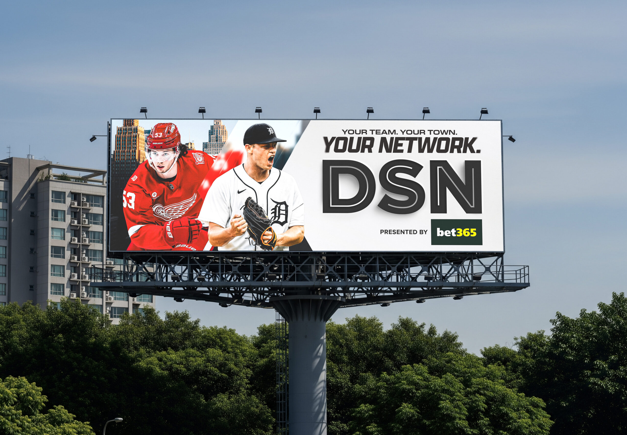
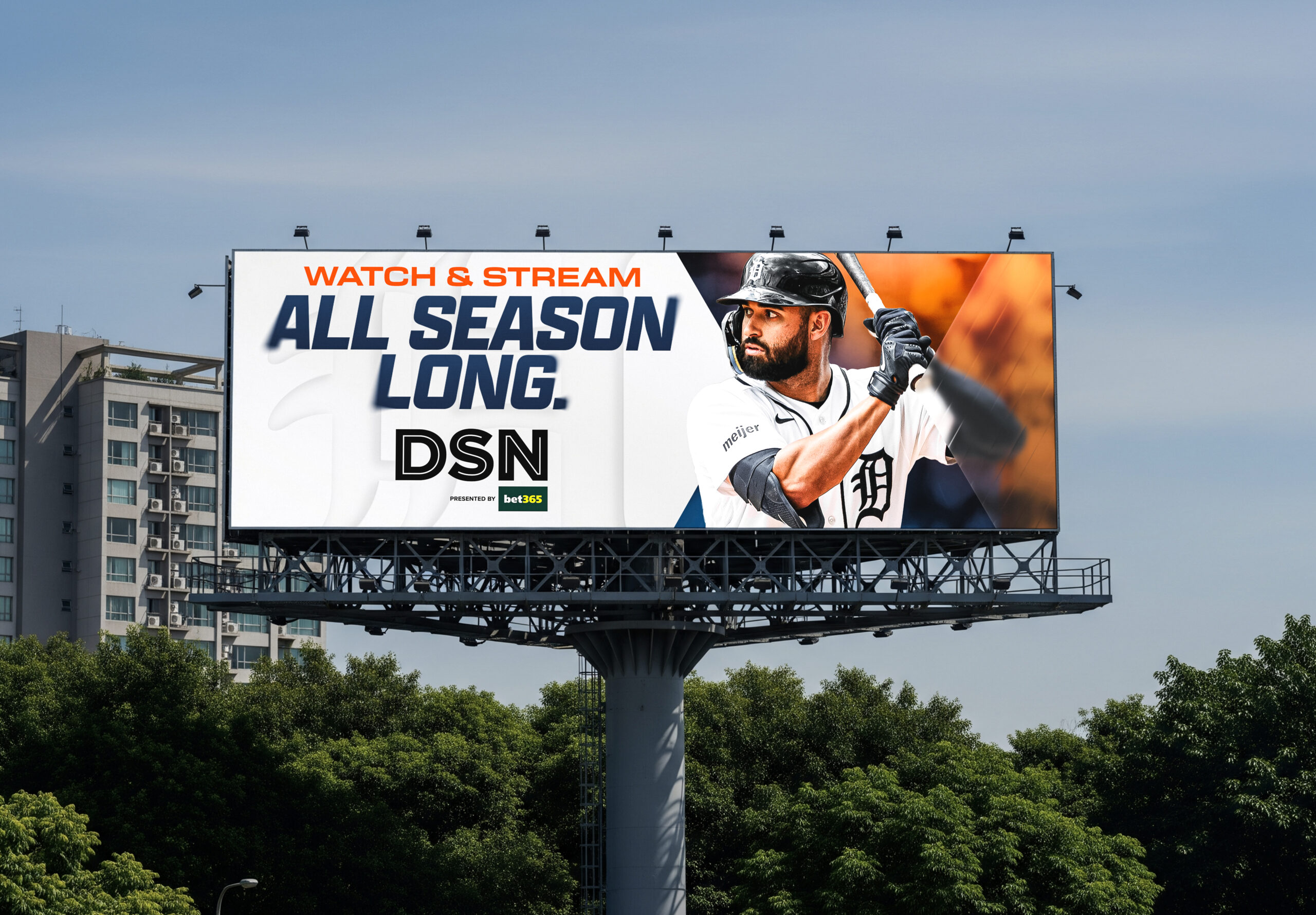
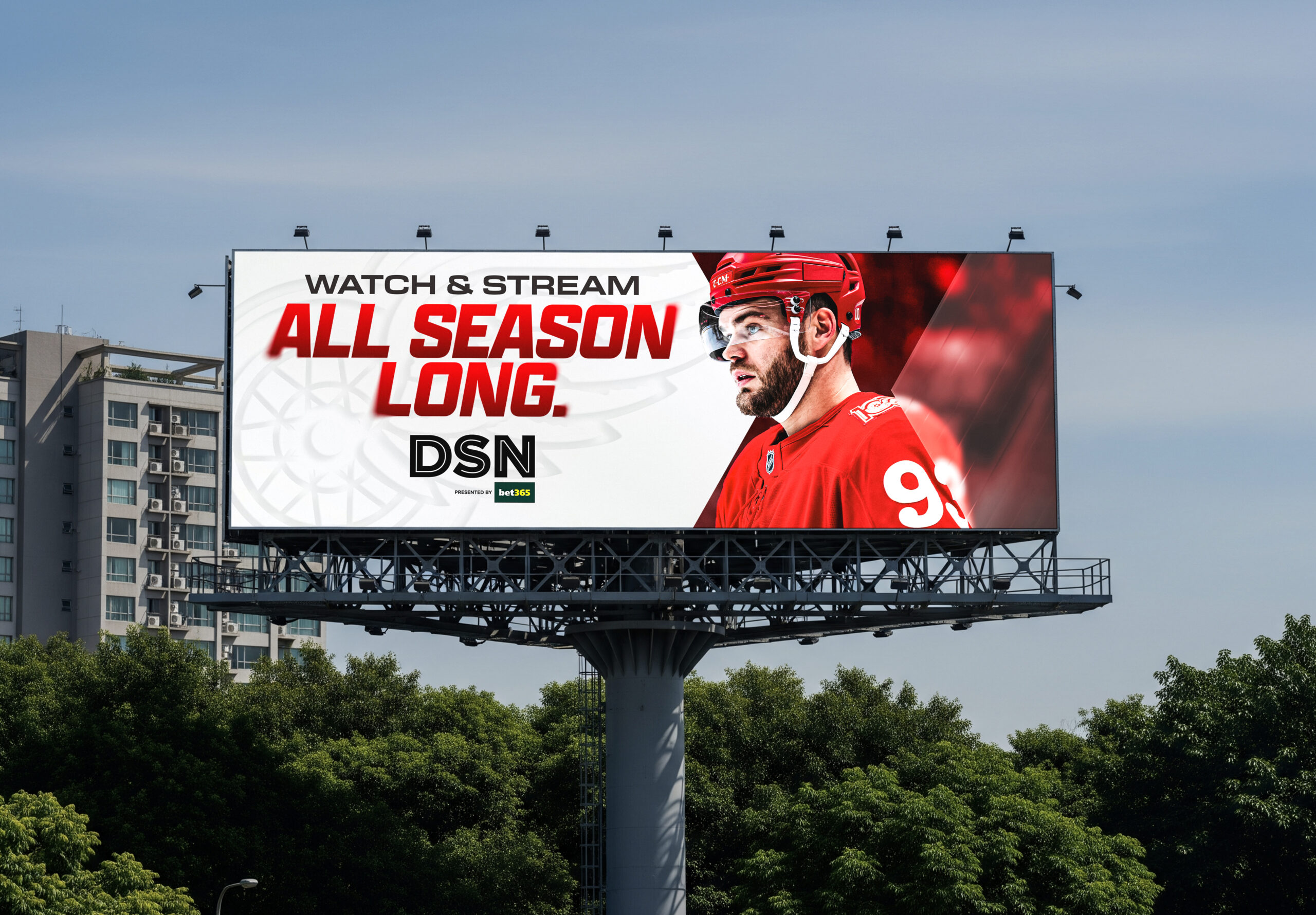
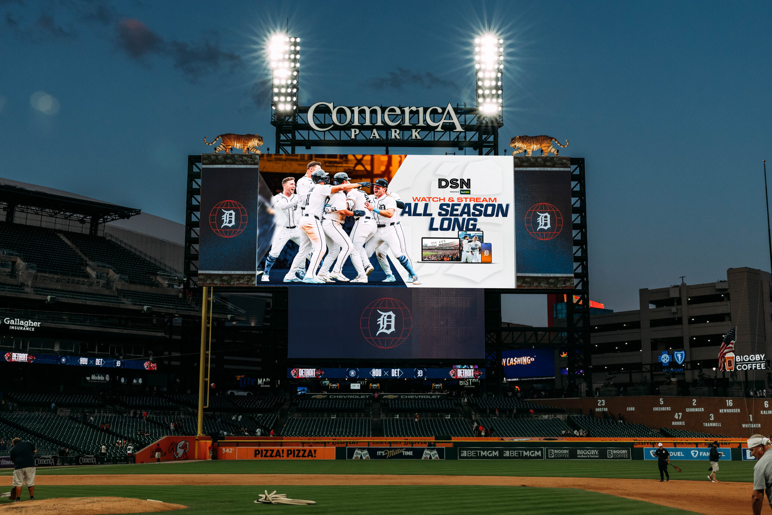
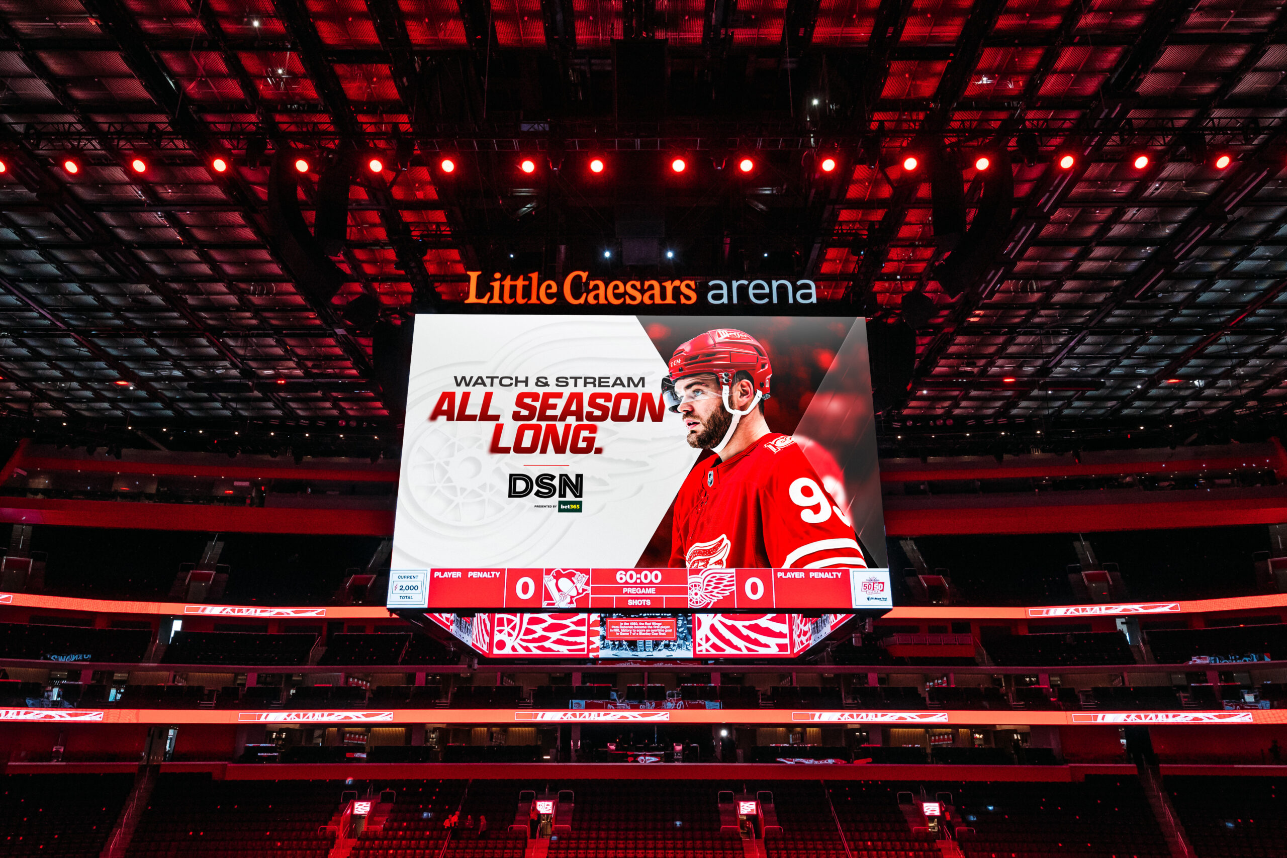
OOH & In Venue